ignyta
precision medicine and biotechnology for the benefit of cancer patients
# visual identity system
# brand book

Patient-focused precision medicine.
A new future
A new future
for cancer patients.


Logotype flexibility to accommodate a variety of demands for use to ensure readability and maintain integrity.
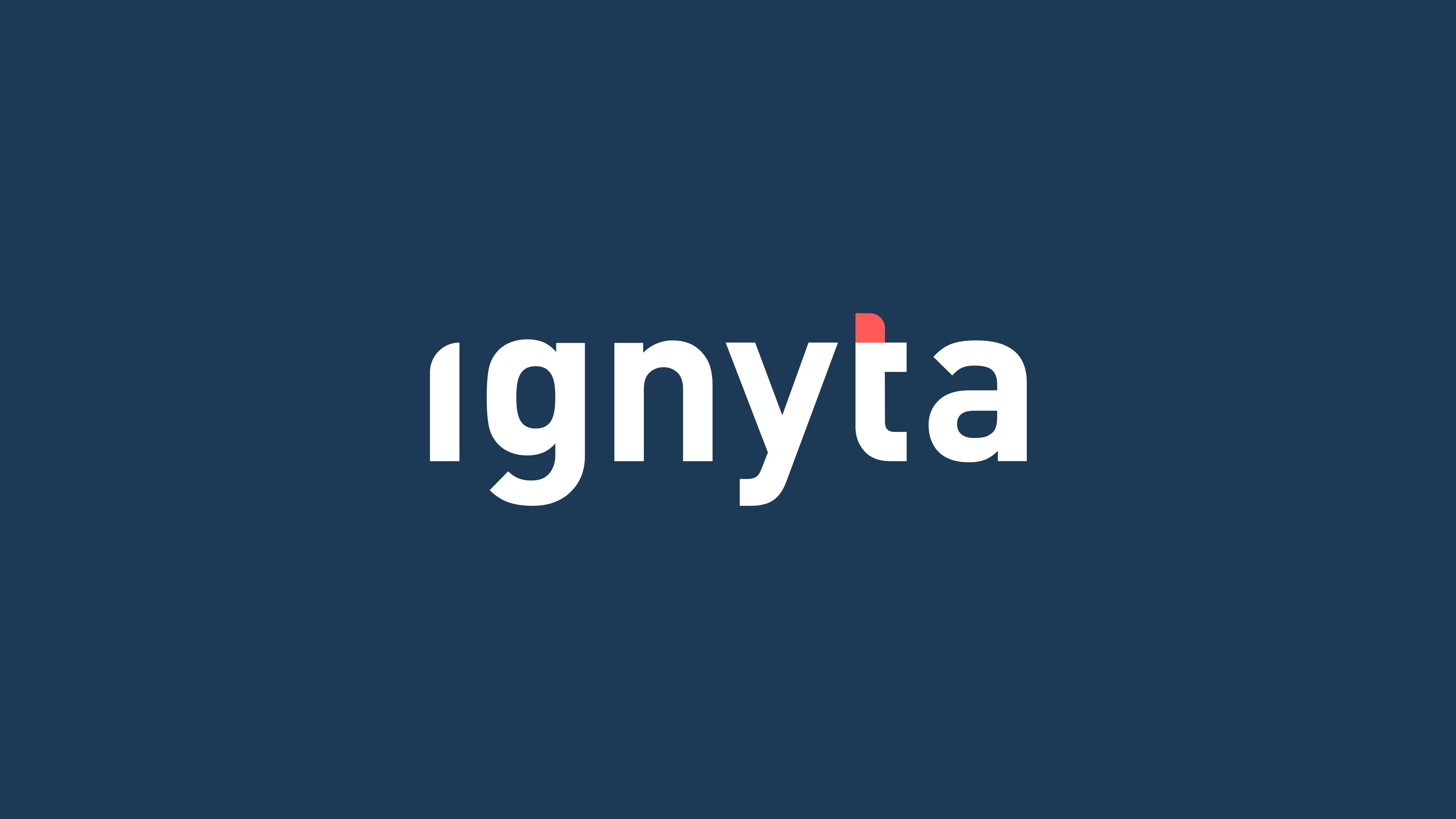
Synthesis of ignition & fire based on external flame outside the container form. The red dot works as a gag and accent of color creating meaning in a subtle way.
The integrity of the ignyta logotype relies on a clear and legible presentation. To provide the proper setting and to comply with brand standards, the logo must be surrounded by space that is clear of graphic or typographic elements.
The integrity of the ignyta logotype relies on a clear and legible presentation. To provide the proper setting and to comply with brand standards, the logo must be surrounded by space that is clear of graphic or typographic elements.

⟵ A detailed construction grid of the letter “t” as the torch of the logotype defining proportions and curved angles on the baseline and ascender.


︎ A spark that ignites a flame.
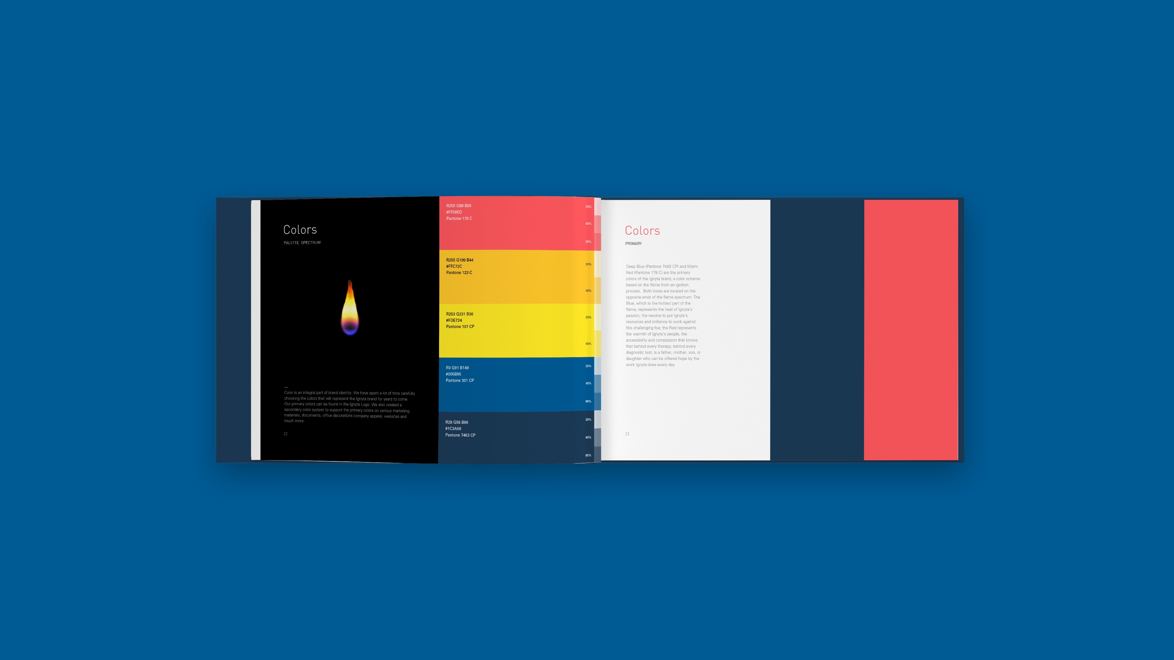
Color is an integral part of brand identity.
Primary colors can be found in the ignyta logo. We also created a secondary color system to support the primary colors on various marketing materials.
Primary colors can be found in the ignyta logo. We also created a secondary color system to support the primary colors on various marketing materials.
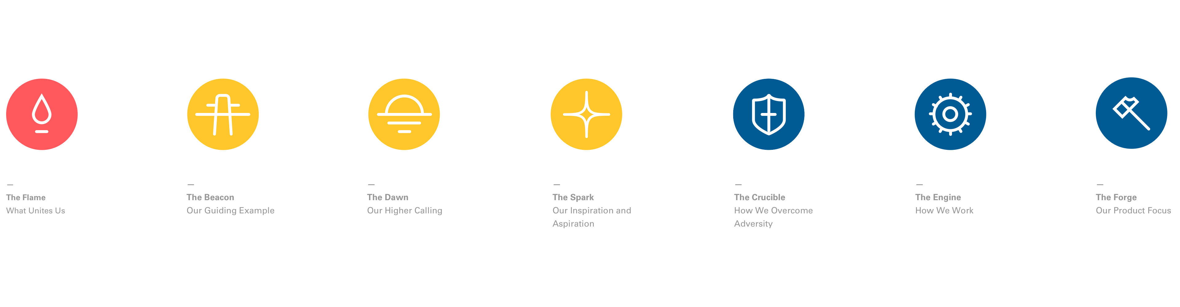
An icon pack associated with the credo and values of the company.


work & general inquiries:
hello@betweenstudio.com
+1 (415) 315-9952
156 2nd St. San Francisco, CA
︎ New York + Barcelona + Buenos Aires
hello@betweenstudio.com
+1 (415) 315-9952
156 2nd St. San Francisco, CA
︎ New York + Barcelona + Buenos Aires